
PLENTY
~
PLENTY ~
Plenty: Reimagining the Grocery Experience
Brand Identity Design
Logo, Packaging, Way-finding, Social Media
Art Director: Kelly Holohan
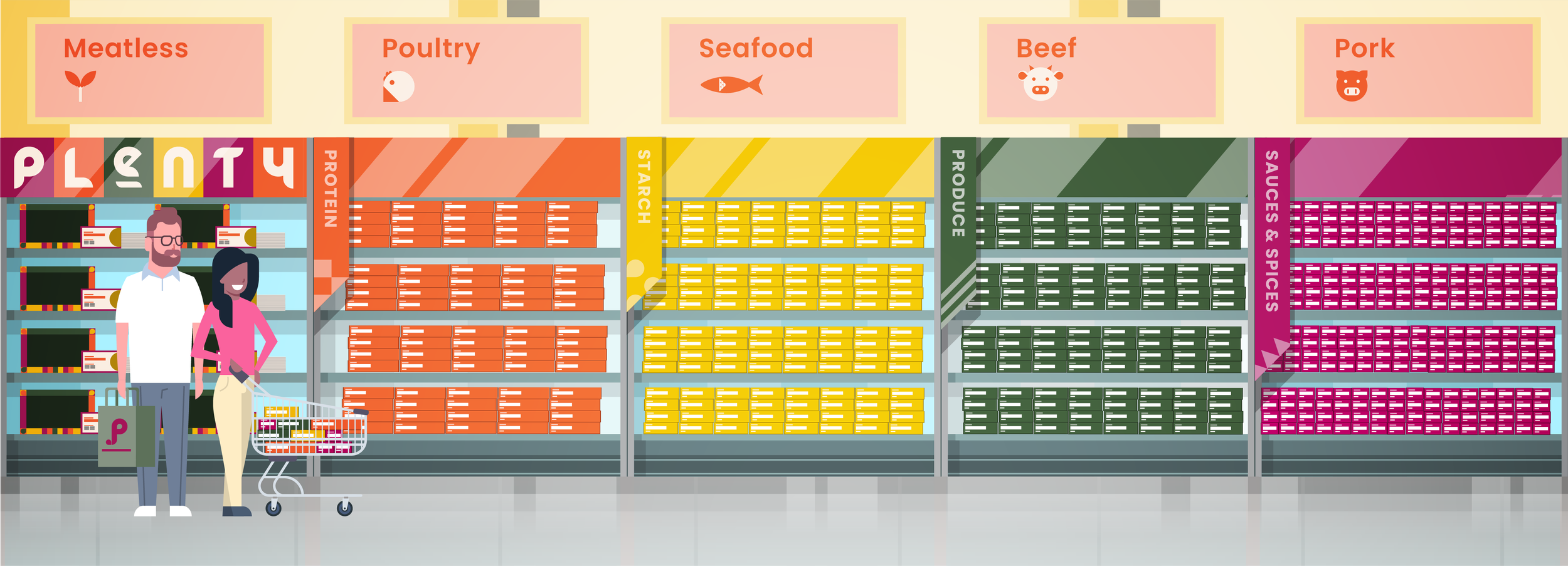
Plenty is a grocery store that specializes in meal prep options. Each aisle centers around a different source of protein. At the beginning of the aisle, each customer can choose from a range of different recipes that center around that protein. As the customer continues down the aisle they choose the corresponding protein, starch, produce, and sauce/spice. Each meal package is designed to have exactly two servings so that customers can be sure they are purchasing the correct amount of food for their needs. The goal of this brand is to create a stress-free shopping experience that empowers our customers to cook more and waste food less.
Mission Statement
Plenty’s mission is to put an end to grocery guilt. By taking a radical new approach to store layout and product packaging, we have streamlined the shopping process and reduced the potential for food waste. Not only will our customers be able to leave the store with a healthy, well-balanced meal, but they can also take comfort in the fact that none of the food they purchase will go to waste.
Where did the idea come from?
I have a personal vendetta against my local grocery store.
My weekly grocery shop is always confusing, stressful, and chaotic. I always walk out of the store with a haphazard amalgamation of food, some of which I need and some of which I picked up on a whim. Inevitably, I get home and realize that I either did not get a few of the key ingredients I need for a recipe or I got way too much of one ingredient and eventually have to throw away perfectly good food. I know that cooking is the most frugal option and I do love to cook when I can, but oftentimes the thing holding me back is getting the actual ingredients. I thought I found a solution in meal prep delivery services but I found them too constricting and unpredictable. Now, I often end up with unhealthy meals just because it is easier. So, when was I presented with this project I knew I wanted to come up with a grocery store that I wouldn’t hate. A grocery store that makes it easy for newly independent people to avoid the pitfalls I run into at my local grocery store.
Early Stages
Vibe, Guiding Words, Moodboard
Vibe
A part of my practice is writing a “vibe statement” at the beginning of a project. A vibe statement is a quick sentence that describes what I want my brand to communicate at first glance. My vibe statement for this project was:
Hello Fresh but with less commitment and more options
Guiding Words
Modularity ~ Accessibility ~ Simplicity
Moodboard

Foundational Elements
Naming, Logo, Style Guide
Naming
Part of my process when coming up with ideas is creating a list of words that associate with abstract thoughts and then condensing that down into the most relevant words. After creating the list, I reexamine the words and modify them into an appealing names. The theme that I stuck to when formulating ideas was: simple, accessible, and carefree.
At this stage, I decided on the name Plenish because it was unique and a fun play on the word replenish. It wasn’t until I got into the logo designing phase that I changed the name to Plenty because “plenish” is a word with an odd number of letters that does not easily stack well and has very little visual symmetry.

Logo
I wanted to emphasize the modularity of the brand in the design of the logo. All sketches and designs were created in a 0.25-inch grid. I also set parameters to only use basic shapes that would work within the grid. Instead of working with an existing typeface, I decided to build my own out of basic shapes and take cues from the Bauhaus typeface.

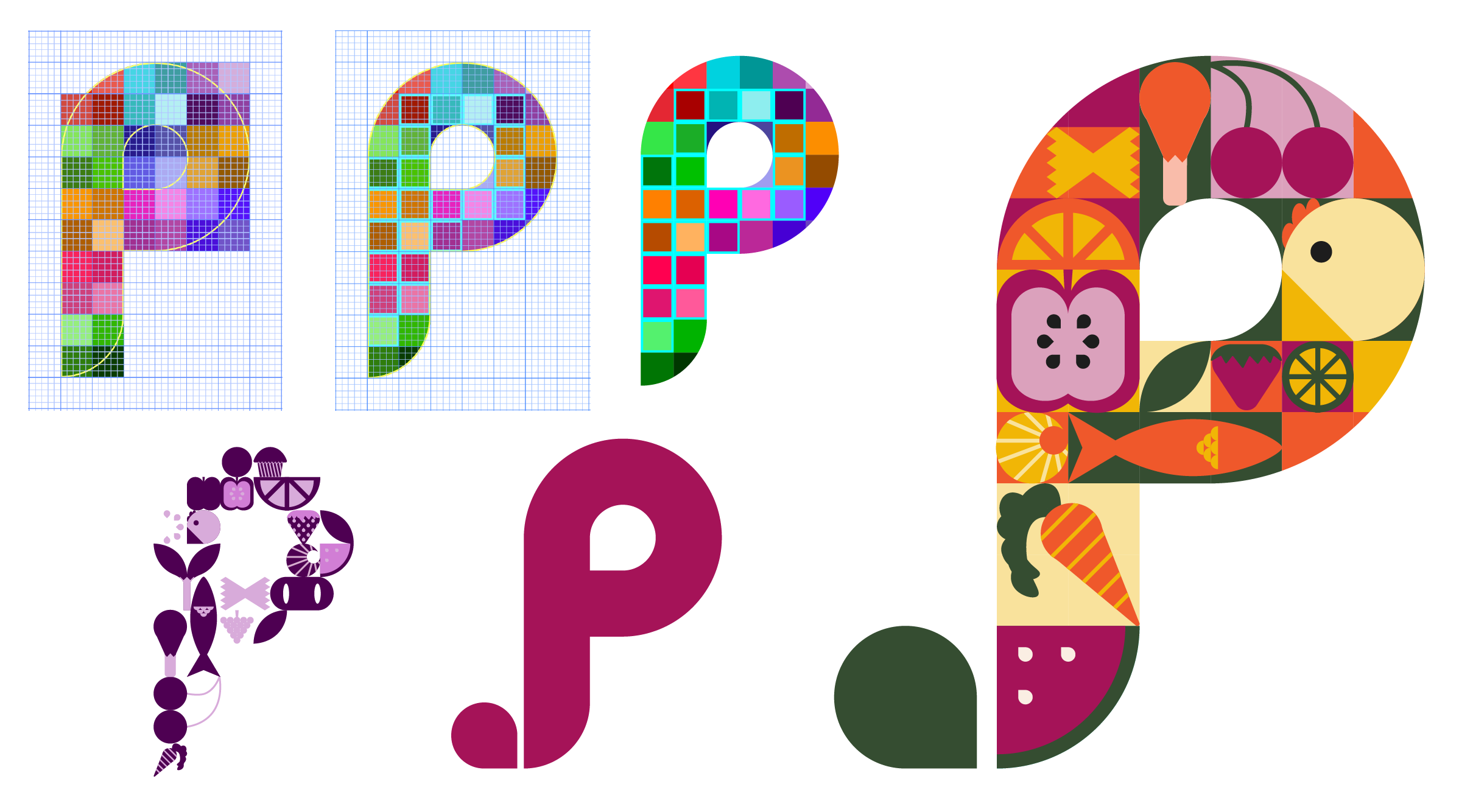
I also played with having symbols in the grid units of the letters. The symbols were only built from simple shapes and spanned a wide variety of foods. While the symbols did not manifest in the primary logo, they became a central part of the design system.

Style Guide
What makes this shopping experience special?
Packaging
How often do you have to throw away a full head of broccoli, or you find a long-forgotten block of cheese? Plenty packages all of its ingredients in boxes that hold exactly what the customer will use for that meal.

Each category of Plenty’s packaging is distinct. The different types of food are color-coded to fit each ingredient category: proteins are orange, starches are yellow, produce is green, and spices/sauces are purple.

Another important part of the Plenty packaging system is the meal box. The meal boxes are located at the beginning of the aisle next to the recipe cards. Each box is made to exactly fit the packages of every ingredient listed in the recipe, similar to a bento box. The meal box is where I had the most fun with the design. I utilized all of my patterns and symbology to make a visually exciting box that would be the cornerstone of the brand.
Box Design Logistics
Adobe’s new program “Fantastic Fold,” ensured accuracy in prototyping the exact measurements so that everything would fit together. I created five dielines in Adobe Illustrator and placed the designs onto them before importing them into Fantastic Fold.

How do customers know which ingredients to choose?
Recipe Cards
Plenty’s recipe cards are an important element of our customer experience. The recipe cards function as a guide for the shopping experience as well as a guide for the meals at home. The ingredients listed on the front of the card correspond to the ingredients on the shelves located in that aisle and customers can select each ingredient as they walk down the aisle.

The recipe cards mark the first addition of photography to the brand identity. I felt it was important to show how the meal should look after following the instructions to give the customers a visual goal to shoot for. I wanted to keep all of the imagery consistent and decided it would be best achieved by keeping it in a uniform shape. By keeping imagery in a circle, there is also a higher contrast between the photography and the angular design elements.
How do we persuade customers to choose Plenty?
Social Media
The Plenty audience is newly independent young adults. This demographic has a large presence on social media and is likely to engage with fun and exciting social media ad campaigns.
The Instagram campaign presented an opportunity to get creative with some of the copy. I tried to come up with fun phrases that reflect the bright and playful side of the brand. I also utilized the photography style from the recipe cards. The contrast between the round plates and the rectangular nature of my branding, as well as the Instagram interface, creates dynamic contrast.

Reflections
Throughout the creation of Plenty, my skills as a designer were challenged and refined. The prompt forced me to push my ideas outside of the expected and create something no one has seen before. Creating a brand from start to finish allowed me to learn more about the importance of consistency and workflow. Every deliverable was built off of the decisions I made in the previous stage and it was exciting to see my idea evolve from one stage to the next.