
Over the Moon
~
Over the Moon ~

Over the Moon Milks
Branding to a Target Audience
Brand Strategy, Visual Identity, Packaging
Art Direction: Caleb Heissey
Over The Moon is an alternative milk brand designed specifically for kids. The brand strategy's primary goal is to attract children's attention within a few seconds and establish a level of trust with the adults purchasing the product. The brand uses a playful and lighthearted approach in its logo, packaging design, and copy to achieve this goal.

Logo
The logo features the word "moo," and a nod to the classic nursery rhyme "Hey Diddle Diddle." This reference is likely to resonate with children and their parents because of their positive associations with fairytales and fantasy.

Packaging
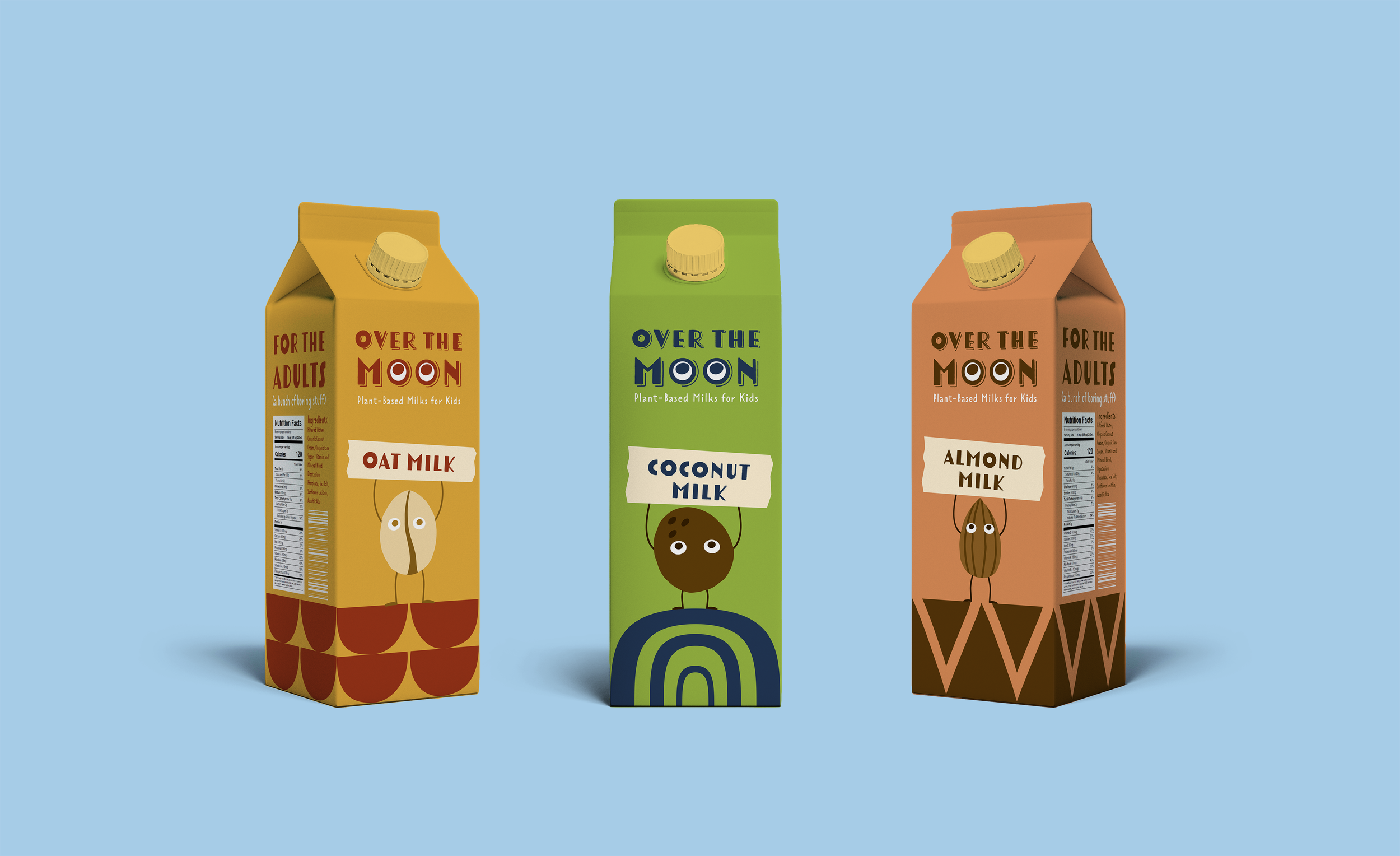
The packaging design utilizes bright colors with high contrast to catch the attention of wandering eyes, but the tones are still natural to convey the plant-based aspect of the product. Illustrations on the packaging show what's inside the product and help convey the brand's message to passersby and children who may not be able to read yet. The copy on the packaging creates a playful mood that speaks directly to the kids while still acknowledging the role of parents in buying groceries. The overall effect is a brand that is fun and approachable for kids, while still being trustworthy and appealing to adults.